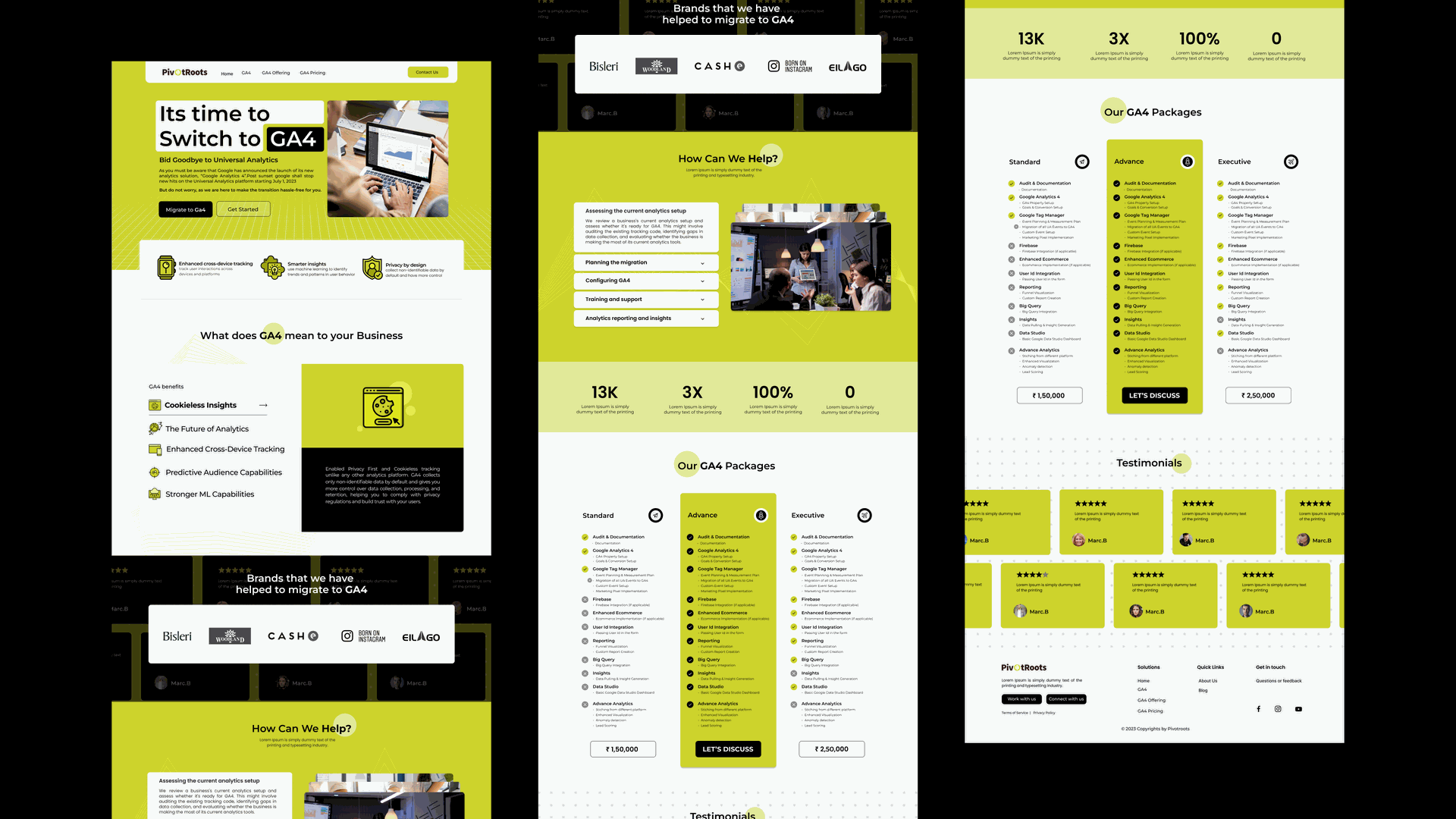
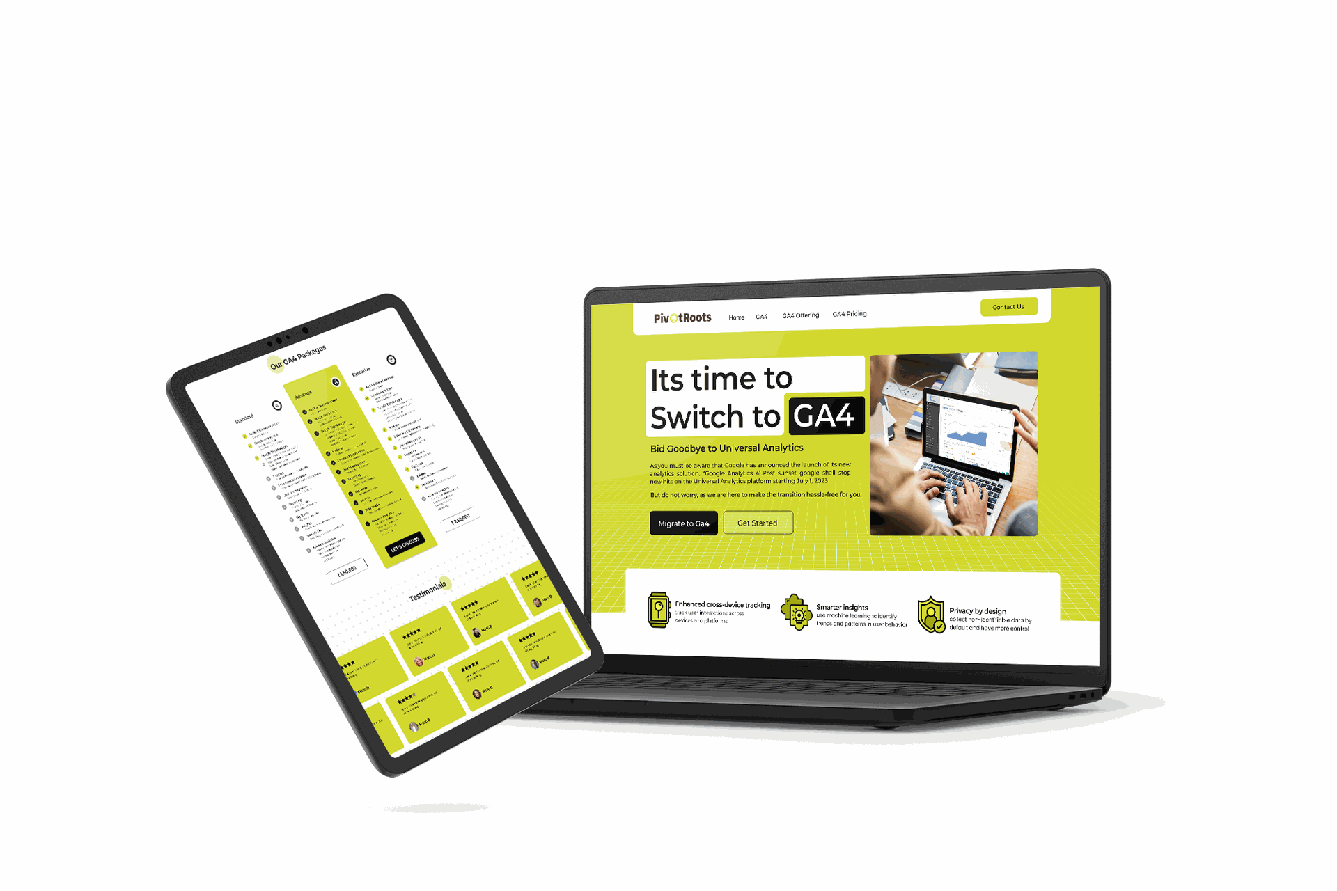
Pivot Roots GA4 Landing Page
Project Overview
Establishing a landing page to market their new GA4 analytics Services
My Role - UI/UX Designer
- Research
- Wireframe
- Responsive Visual Design
STARTING FROM SCRATCH
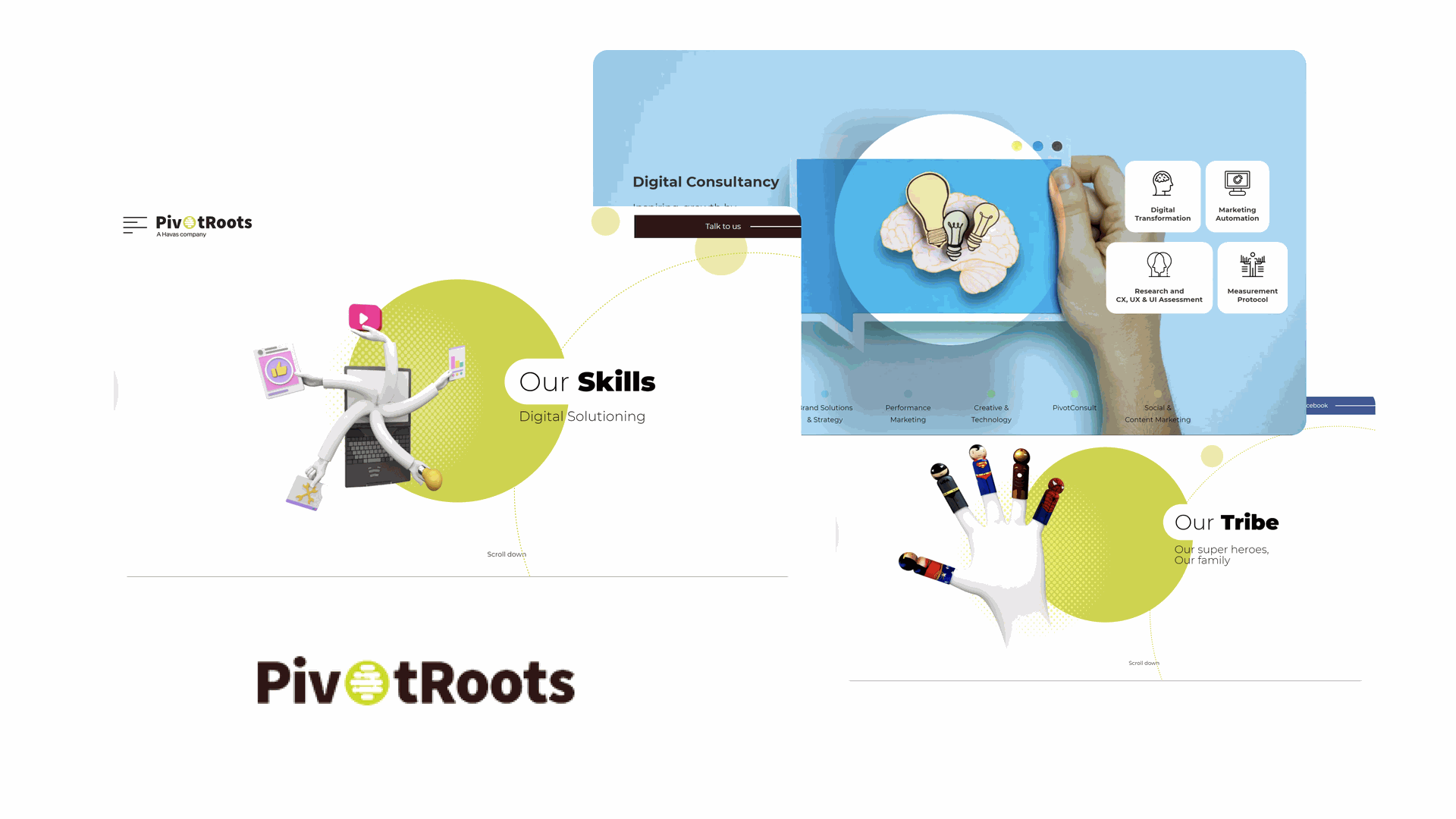
The client was looking for a stylish and creative design for their GA4 services. Since their main website is full of creativity and interactions, they wanted to keep the same vibe for their new website - simple yet eye-catching to showcase their services.
Problem Statement & Challenges
Creating a compelling landing page for Pivot Roots' GA4 offerings involves addressing several key challenges while ensuring the page is attractive, informative, and user-friendly. Below is a breakdown of the problem statement and the challenges involved, along with potential solutions.
Problem Statement
Pivot Roots aims to develop a visually appealing and effective landing page to promote their GA4 (Google Analytics 4) offerings. The landing page should:
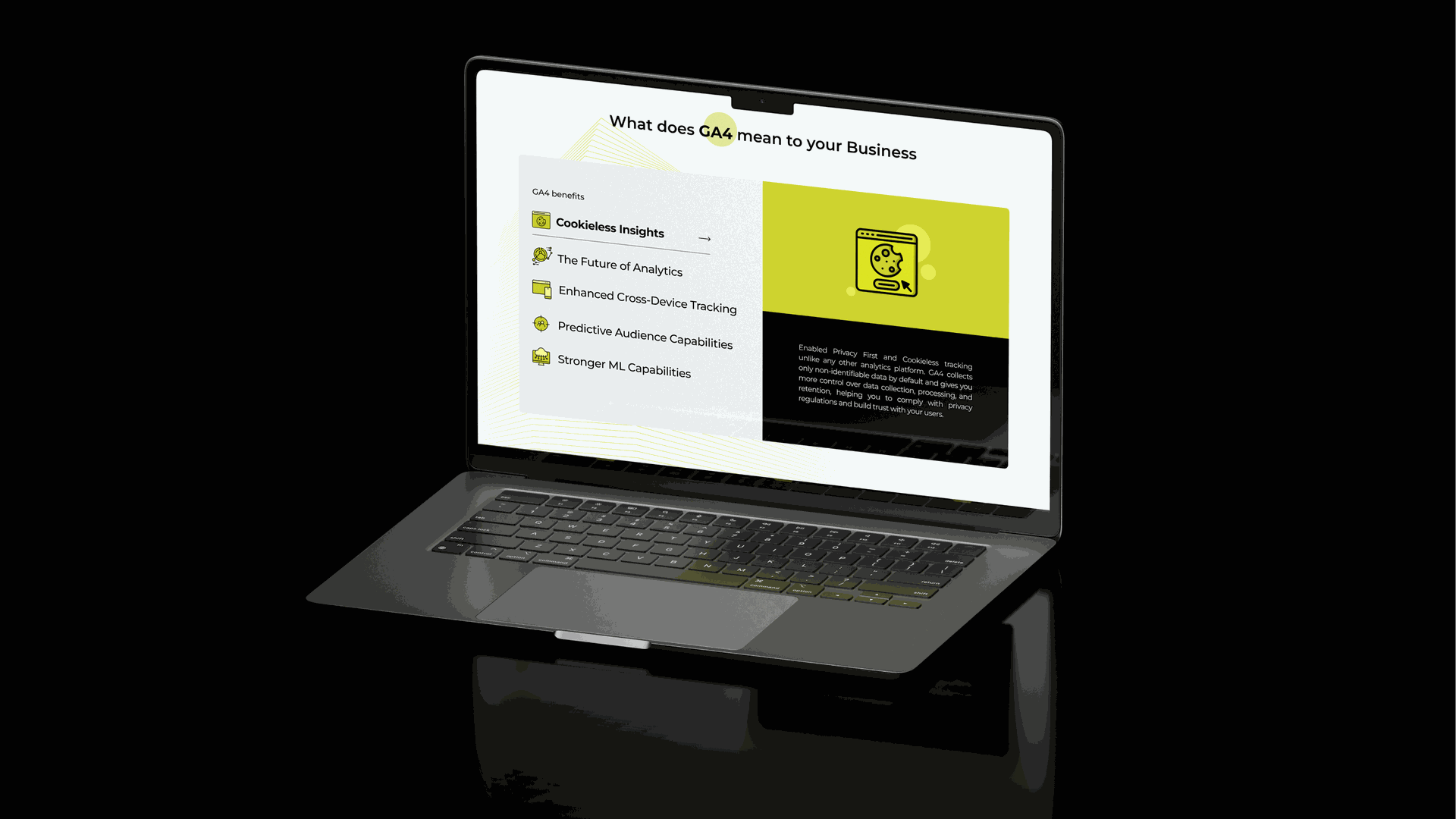
- Communicate the Value of GA4: Clearly explain the benefits and features of GA4 to potential customers.
- Showcase Services: Highlight the specific GA4-related services offered by Pivot Roots.
- Present Pricing Information: Transparently display pricing details for different service packages.
- Brand Consistency: Adhere to Pivot Roots’ branding and guidelines.
- User Experience: Ensure the page is easy to navigate, not cluttered, and includes interactive elements to engage visitors.
Key Challenges
- Clear Communication: Explaining complex GA4 features and services in an easy-to-understand manner.
- Visual Appeal: Creating a visually attractive design that captures attention without overwhelming the user.
- Brand Consistency: Sticking to brand guidelines in terms of colors, fonts, and overall style.
- Interactive Elements: Incorporating interactive features that enhance user engagement without cluttering the page.
- User-Friendly Layout: Organizing content logically to ensure a seamless user experience.
Solution
- Clear Communication
- Simplify Messaging: Use clear, concise language; avoid jargon.
- Visual Aids: Use infographics, icons, and short videos to explain complex concepts.
- Structured Information: Use headings, bullet points, and short paragraphs for easy readability.
- Visual Appeal
- Clean Design: Opt for a minimalist design with effective use of white space.
- High-Quality Visuals: Use high-quality images and graphics aligned with the brand’s aesthetic.
- Consistent Color Scheme: Maintain a color scheme that reflects the brand's identity.
- Brand Consistency
- Brand Guidelines: Adhere to brand guidelines for colors, fonts, logos, and design elements.
- Consistent Tone: Use a consistent tone of voice across all content to reflect the brand’s personality.
- Interactive Elements
- Interactive Pricing Tables: Allow users to easily compare different service packages.
- Engagement Tools: Use chatbots or interactive FAQs for real-time assistance.
- Call-to-Actions (CTAs): Place clear and compelling CTAs to guide user actions (e.g., "Get Started", "Contact Us").
- User-Friendly Layout
- Logical Flow: Arrange content logically to guide users through the page naturally.
- Navigation Bar: Include a sticky navigation bar for easy section access.
- Mobile Opti
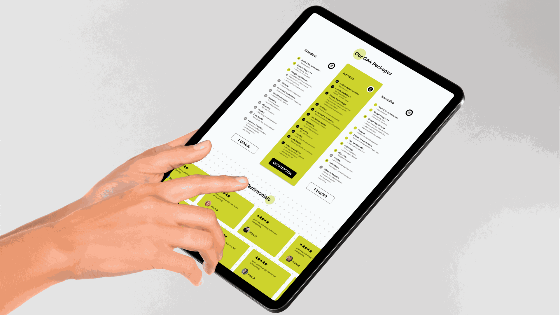
Design Process
For each of our projects, we consistently follow the Double Diamond process. This approach assists us in establishing clear goals and empowers the team to develop designs that meet the needs of both the client and the user.
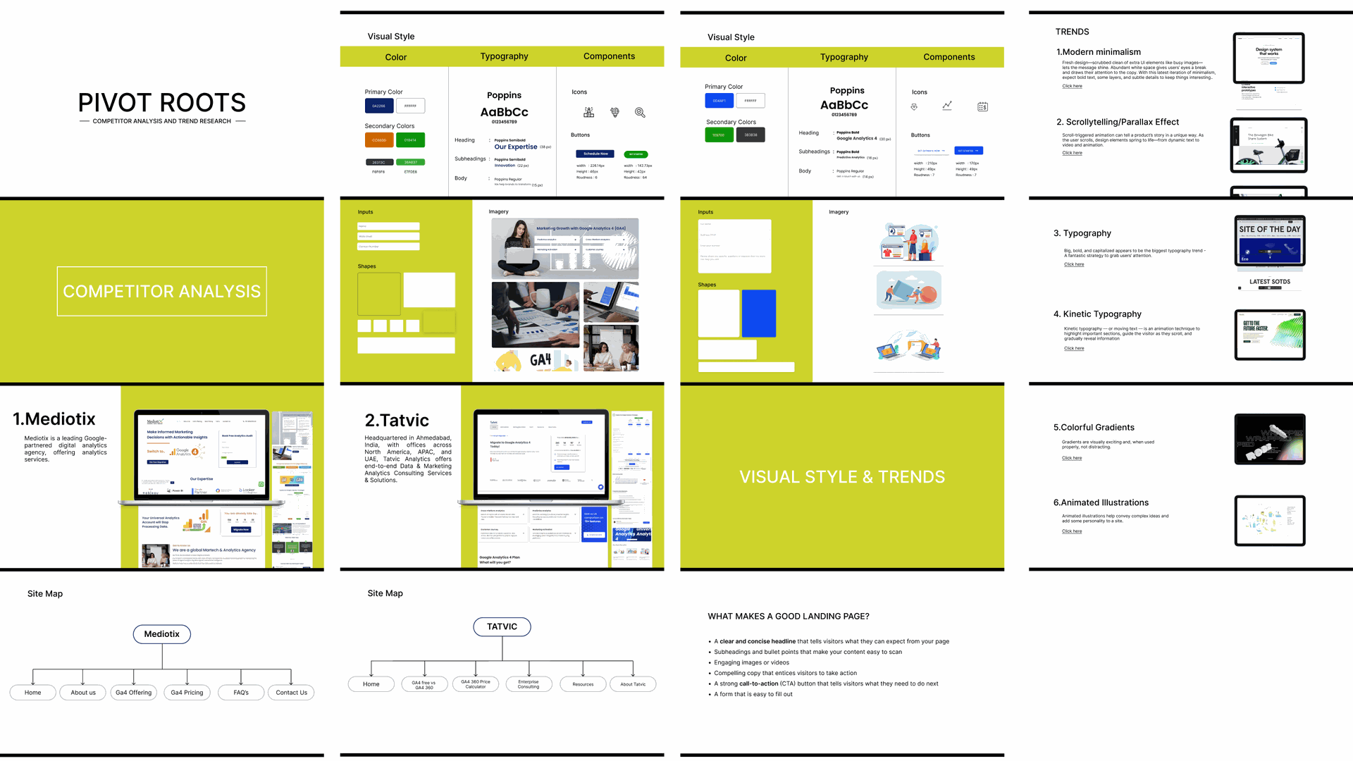
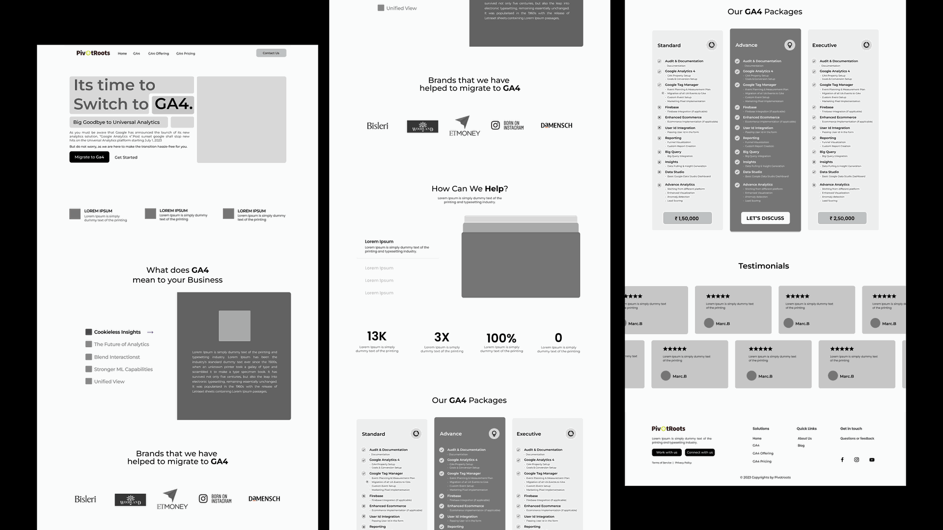
To start off, we conduct thorough market research and competitor analysis to grasp the market landscape and examine how ga4 functions and how others are currently implementing it. Following this, we move on to creating wireframes, seeking approval, and then diving into the design phase. Throughout this process, we always offer multiple iterations for both wireframes and UI designs to further refine them.
Wireframes
UI Design
